


Typography in design

First impressions matter, as every brand pro knows. Most users will leave a web page very quickly if the content isn’t clear and compelling. Your creative team works hard to convey your brand message in engaging, accessible language. Now they’re counting on you to make good typography and design decisions for better readability and brand engagement.
Read on to learn more about:
- What typography is, and why it’s important
- 5 most popular kinds of typefaces, and 6 key elements of typography
- How to find and explore typefaces and fonts with Figma
What is typography?
Typography in design involves creating or selecting a system of typefaces and fonts to express the written word. This creative art form can evoke strong emotions, using visually appealing letters and arranging type to express your brand personality. Well-crafted typography can enhance clear communication, with easy legibility and readability.
Why is typography important?
Typography plays a key role in creating quality websites, apps, emails, ebooks, and more. Good typography can help you:
- Attract users with typefaces and typographic elements that grab their attention even before they start reading.
- Set visual hierarchy with consistent type sizes, weights, serif and/or sans-serif fonts, font pairings, and typeface combinations to guide users and improve readability.
- Build brand recognition. When used consistently, good typography helps users identify your brand through the typeface and font styles used for your branded content.
- Supports content goals. Consistent letter spacing, line lengths, upper and lowercase letters, and other typographic elements boost legibility, while fonts used as graphic design elements amplify tone and meaning.
A brief history of typography
Johannes Gutenberg helped spark a European typeface evolution in the 1400s, when he invented the first metal movable-type printing press. Gutenberg used old style blackletter calligraphy letterforms (aka Gothic) to typeset longer lines of text for manuscripts and religious texts. Printers in Italy soon created a simpler, more compact typeface—originally called Antiqua, now better known as Roman. European printers then launched italic typefaces, typesetting even more words per page.
Fast-forward to the late 1700s and early 1800s, when the first modern serif typefaces entered the market. Sans-serif typefaces followed, dominating the European print world until the 20th century. That’s when cleaner, more legible typefaces such as Times New Roman, Futura, Helvetica, and Arial took over. Today, graphic and web designers worldwide access large libraries of typefaces and fonts.
5 most popular kinds of typefaces
Modern designers typically choose from five popular kinds of typefaces: serif, sans serif, script, monospace, and display. Each typeface includes a family of fonts, covering that typeface’s various styles. For example, Helvetica is a typeface, while Helvetica Light and Helvetica Regular are fonts.
- Serif fonts: This formal, more traditional typeface has short lines or strokes that extend off the upper and lower ends of letterforms. Established brands such as New York Times, Sony, and J.P. Morgan opt for a serif typeface. Examples include Times New Roman and Garamond.
- Sans serif fonts: This simple, modern typeface doesn’t include the flourishes found in the serif typeface. It’s a popular choice for youthful brands and tech startups (think Target, Airbnb, and Doordash). Sans serif typeface examples include Helvetica, Arial, and Calibri.
- Script fonts: This fluid, cursive typeface can range from elegant calligraphy to playful handwriting styles. Not ideal for body text, a script typeface works best for quotes, signatures, and short headers. Examples include Snell Roundhand, Pacifico, and Scriptina.
- Monospace fonts: This retro, typewriter-style typeface displays fixed-width letters and spacing, so that each word’s character takes up the same width. Used in source code for easier readability, monospace typeface also appears across numerous websites and graphic designs. Examples include Courier, Bergen Mono, and Source Code Pro.
- Display fonts: Also known as decorative, this attention-grabbing typeface can add some flair and originality to logos, banners, and headings. Display typeface examples include Clearview, Johnston, and Skywalker.
Key elements of typography
You can fine-tune the look, legibility, and mood of a word, line of text, or product by adjusting one or more typographic elements.
Alignment
To achieve balance and help users easily move down a page, align design elements, such as your logo, an image, header, and body text. Equally space each design element, and employ margins and padding consistently. Left-, right-, full- or center-justify your text based on your project needs. For example, designers may center-justify a heading or short quote, but left-justify long-form copy.
Color
Select a color palette that’s consistent with your brand and clearly conveys your message. Adjust text opacity and use complementary colors that contrast well against each other to ensure readability and accessibility, you can use a color wheel generator to create a well balanced color palette. Pro tip: See Web Content Accessibility Guidelines for ideal contrast ratios. Bolder, brighter colors may work better for headings and subheadings, while neutral colors suit large blocks of text.
Hierarchy
Developing hierarchy in your typography helps prioritize and surface key information so it’s easy to scan and digest. Make headings larger than subheadings, and subheadings larger than body text. For example, website body text is typically 16px, with H1 headers set at 48px. Play with white space, text alignment, color, and different typefaces to reinforce visual hierarchy.
Kerning
Adjust the amount of space between individual letters so that the distance appears consistent. Proper kerning helps boost your text’s visual appeal while improving legibility.

Leading
Leading refers to line height—the distance between one text line’s baseline and the baseline of the text line above it. In general, a line height that’s 1.125 and 1.200 times the font size (112.5%–120.0%) results in better readability. That said, every typeface requires fine-tuning—including careful line-spacing.
Tracking
You can improve readability with tracking (aka character spacing), which covers the overall spacing between letters in a word or line of text. Increase tracking to add space, and decrease tracking to reduce it. Words or phrases displayed in all capital letters are sometimes easier to read with increased tracking.
How to pick the right typeface
The process for choosing a typeface breaks down into these key steps:
- Consider your project scope, requirements, and goals. Ask your team key content questions: How are we delivering content (via app, website, email, or print collateral)? Who’s our audience, and what are their needs? What typefaces and fonts do our competitors use? Keep in mind that some typefaces work better for headers than menu text. Others have large font families with international scripts, glyphs, and other special characters.
- Create a mood board to develop a visual tone, based on user and competitive research. To get started, use FigJam’s mood board template. Pro tip: Looking at comparable solutions can help identify useful patterns and norms.
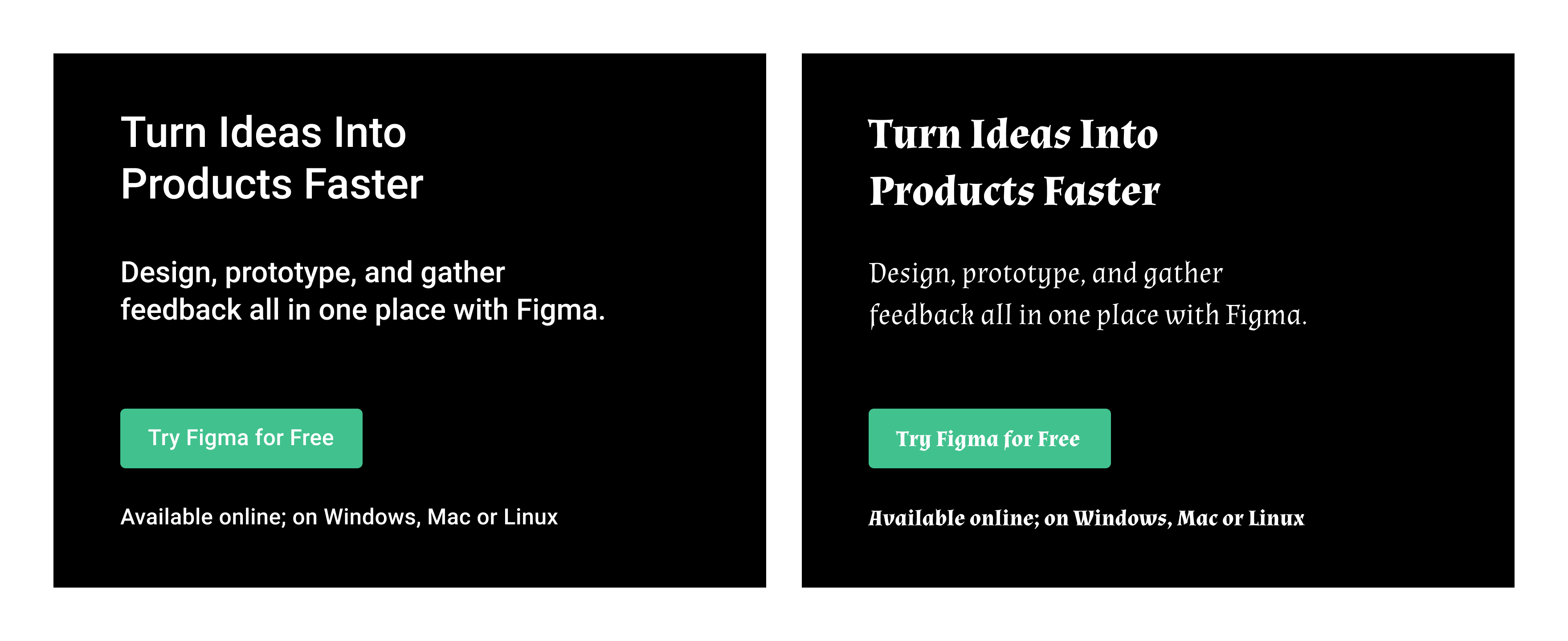
- Explore typeface options on your computer or on sites such as Google Fonts. Look for a typeface with visual cues that echo what you want your product or brand to convey. For example, if your brand’s tone is professional rather than light-hearted, pick a serious typeface with few embellishments. Which of these Figma design examples appears more professional to you? If you picked the module on the left, you’re on the right track. That module employs Roboto, a clean, easy-to-read sans serif typeface. The module on the right includes Almendra, a calligraphy-based typeface often used in children’s books.

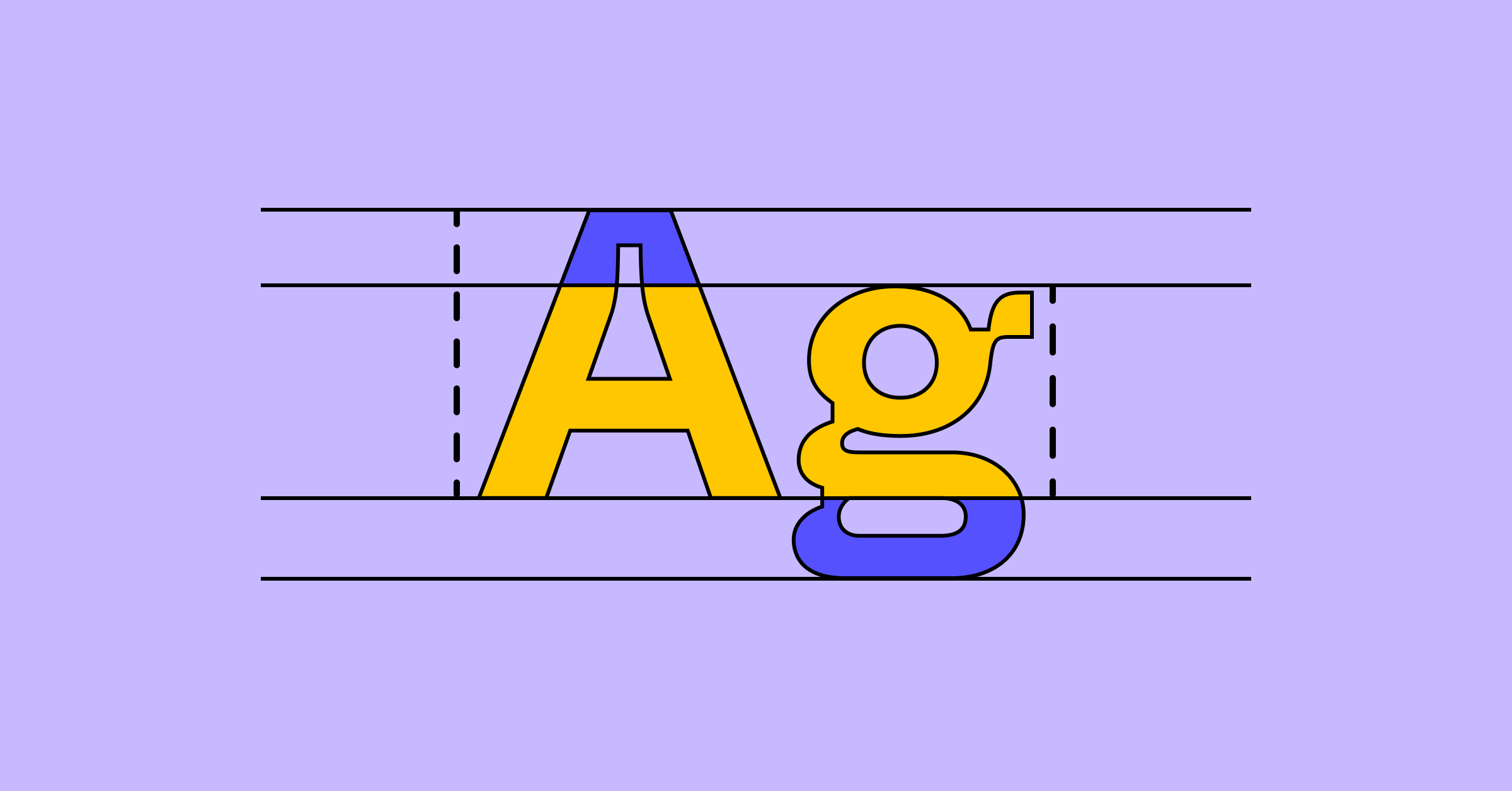
- Pick typefaces that are on-brand and eye-catching to support your project goals. Consider the overall construction of the letters (e.g., x-heights, cap heights, counters, ascenders, and descenders), ability to scale, legibility, personality, and decoration. These elements influence a typeface’s overall look and feel.
- Try out your typefaces with real, relevant content. This is the best way to choose a typeface that engages your users. Try the typeface in a few different sizes to make sure it works for both large and small text.
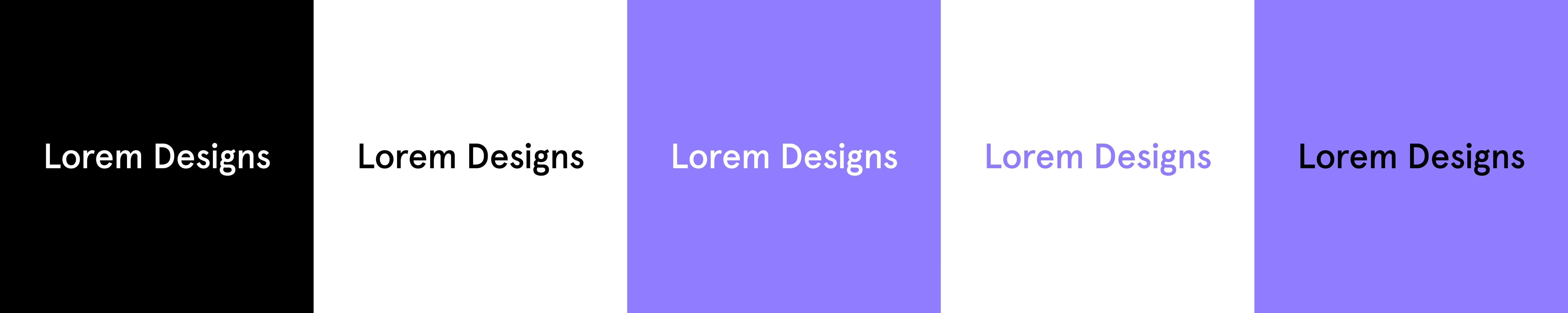
- Test your brand colors on your typeface. Start by placing black text on a white background and white text on a black background. Then apply your primary brand color to the text, and see how the typeface works against both white and black backgrounds. Reverse the colors to see how white and black text looks on a background in your primary brand color.

Weight and style
In a typeface, for example, Montserrat by Julieta Ulanovsky and studio, there are multiple styles and weights — such as regular, bold, italic, thin, black, etc. — and each has a font. A font is a file for installing and using a set of type in a particular font weight and text style. A typeface with multiple weights has a font for each weight, together they are known as a font family.
The typeface Montserrat has a font family of 18 fonts: Thin, Thin Italic, Extra-Light, Extra-Light Italic, Light, Light Italic, Regular, Regular Italic, Medium, Medium Italic, Semi-Bold, Semi-Bold Italic, Bold, Bold Italic, Extra-Bold, Extra-Bold Italic, Black, and Black Italic.
Weight refers to the thickness of a letter’s stroke. A typeface can range in weights from hairline to ultra-black and have many fonts in between, while some typefaces may come in only one weight. These weights also have a number association, which is helpful to understand when programming or collaborating with a developer. Weights generally coordinate to a number on a scale of 100 to 900, with intervals of 100: Regular 400, Medium 500, Semi-Bold 600, Bold 700, etc.
Font style is the adjustment of the characters or case, such as italics and all caps respectively. Some typefaces have no style option, and sometimes only offer a Regular weight.
Letter case also referred to simply as “case,” is the distinction between smaller letters like lowercase and larger letters like uppercase or capital letters. Most typeface sets have letters in both, while fonts like Bangers are set in uppercase only. Typefaces set in only uppercase or only lowercase letters are far less common.
In English, the various case styles are used differently, depending on the circumstances:
- Title Case, is a Mixed-case Style Where All Words in a Sentence Are Capitalized With The Exception of Articles, Short Prepositions, and Conjunctions. These Exceptions Are Somewhat Subjective.
- Sentence case is what we’re used to seeing text written in, including this sentence.
- ALL CAPS is when all text is uppercase and is commonly used for headings, wordmarks, button text, or other types of labels. Use it for emphasis, rather than long-form text where the lack of ascenders and descenders can make it hard to read in large quantities. All Caps is also used online to imply yelling, so avoid using it in chat- and conversation-based interfaces.
- Small caps are similar in form to capital letters but are as tall as the x-height of the typeface. Small caps are used to distinguish from body text and heading text, however, they are not offered in many typefaces.
- all lowercase text is a stylistic choice used in some products and wordmarks for aesthetic purposes.
Size
Setting and changing the type size of type can be a difficult decision. It will depend greatly on the medium that the text will appear, like paper or mobile phone or billboard, and can change depending on the viewer’s device, or responsiveness of the design.
It’s important to determine hierarchy with your type choices, using size as one of the elements of emphasis.
In web development, some key sizes need to be defined, such as the heading, subheading, body text, menu and footer text, etc. A lot of designers start with the heading size, also known as the H1, but it may be helpful to begin with the body text size, as that is how front-end developers might implement it. When a developer works in ems, a unit of measure based on scaling, the body text size is 1em and every other text size is a multiple or fraction of it.
For example, a common body text size for the web is 16px. The H1 may be set at 3em, or three times the body text size, in this case 48px. As the web page is going to be designed for multiple screen sizes, the designs you create may call for different font sizes depending on the customer's device. The developer can have the body text size change with the browser dimensions of your customer, and all other text will scale accordingly.
Details
A lot of typography is the little details and nuance.
For example, when laying out text one of the aspects to examine is the rag. The rag is the uneven edge of left- and right-aligned text. It can be manipulated by increasing and decreasing the width of a text box or changing the lettering-spacing of the whole body of text.
When one or two words end up at the end of a paragraph it’s typically called a “Widow.” Or at the beginning of the next column, an "Orphan."
However, as May-Li Khoe points out:
Referring to a word of text on a line by itself as a "widow" or "orphan" is kind of a bummer, especially because I am an orphan. I like calling it a dangly instead.
Refer to them as "danglies" instead.
As text boxes are adjusted to prevent danglies, the line length is being adjusted. For body text in English, limiting line length to approximately 40 to 60 characters, including spaces and punctuation, is ideal for accessibility and readability. If line lengths need to be longer than 60 characters, increase the line height for better readability.
One of the easiest ways to make a document or interface look and feel well designed is consistency in where objects sit in space.
Say your app screen has a title and it is 100px from the top of the frame or screen. You want all the other app screens with similar titles to have those titles in the same place.
Guides and measurements are your friends here — just click and drag from a ruler in Figma to create a guide, and hold the Alt key when an object is selected to see the distance to the objects around it.
Consider the left side, or left vertical margin, of a website, poster, app screen, infographic, etc., containing a logo, an image, a header, and some body text. Aligning these elements to each other will make it easier for the eye to move down the page, but also makes the layout of this content seem considered and intentional.
Justification is a concept of alignment specific to blocks or line of text.
- Left justified is when the beginning of each line of text starts at the same x value along a left margin. This is also known as left-aligned and it creates a rag on the right.
- Right justified is when the end of each line of text is flush against a right margin. This is also known as right-aligned and it creates a rag on the left.
- Full justified is when both the left and right ends of lines of text are flush to both sides of the text box. Letter-spacing and word-spacing are adjusted to set each line of text to a consistent width. There is no rag with full justification.
- Centered text is the absence of justification.
Jumpstart your typography explorations with Figma
Figma provides professional design resources to get you started, including Figma’s design tool and typeface exploration example. You can also build brand moodboard using FigJam’s moodboard maker.
For more pro tips, see Figma’s article on how to build and implement typography systems in Figma.
Need inspiration? Check out the robust library of typography templates, examples, and style guides shared by the Figma community.
Ready to find a typeface that elevates your brand?